


悬停翻转的3D卡片
AI-摘要
Tianli GPT
AI初始化中...
介绍自己
生成本文简介
推荐相关文章
前往主页
前往tianli博客
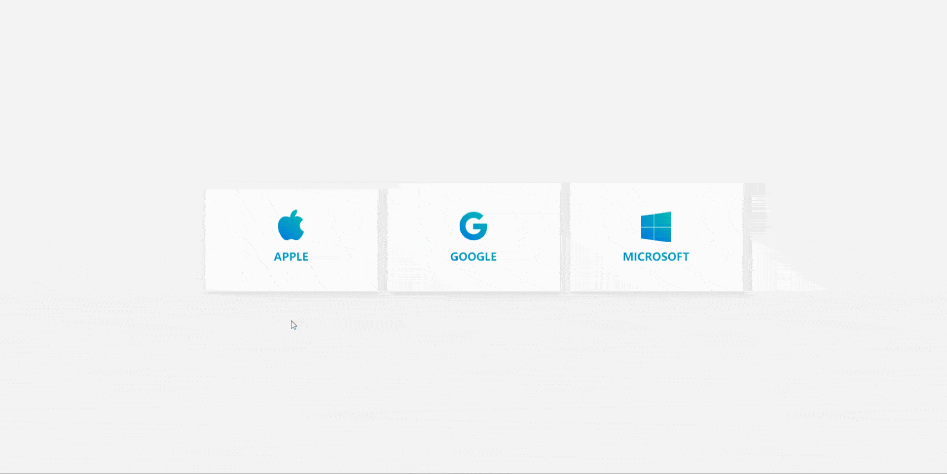
设置两个DIV,显示上面这个front,隐藏下面这个back,back设置为绝对定位。
.box .front{
background-color: #fff;
width: 100%;
height: 220px;
/* 弹性布局 垂直排列 垂直居中 */
display: flex;
flex-direction: column;
justify-content: center;
/* 阴影 */
box-shadow: 0 5px 20px rgba(0,0,0,0.1);
/* 设置过渡 */
transition: 0.5s ease;
}

.box .back{
/* 绝对定位 */
position: absolute;
top: 0;
left: 0;
z-index: 1;
width: 100%;
height: 220px;
background: linear-gradient(220deg,#02dbb0,#007adf);
padding: 30px;
color: #fff;
/* 默认不透明度为0 */
opacity: 0;
/* 默认位置下移并旋转-90度 */
transform: translateY(110px) rotateX(-90deg);
/* 设置过渡 */
transition: 0.5s ease;
}
鼠标Hover之后,通过transform: translateY(-110px) rotateX(90deg)来变换两个的位置。
.box:hover .front{
opacity: 0;
transform: translateY(-110px) rotateX(90deg);
}
.box:hover .back{
opacity: 1;
transform: translateY(0) rotateX(0);
}
此处仅供记录,作者:艾恩小灰灰 https://www.bilibili.com/read/cv20006407
阅读建议

评论
隐私政策
你无需删除空行,直接评论以获取最佳展示效果